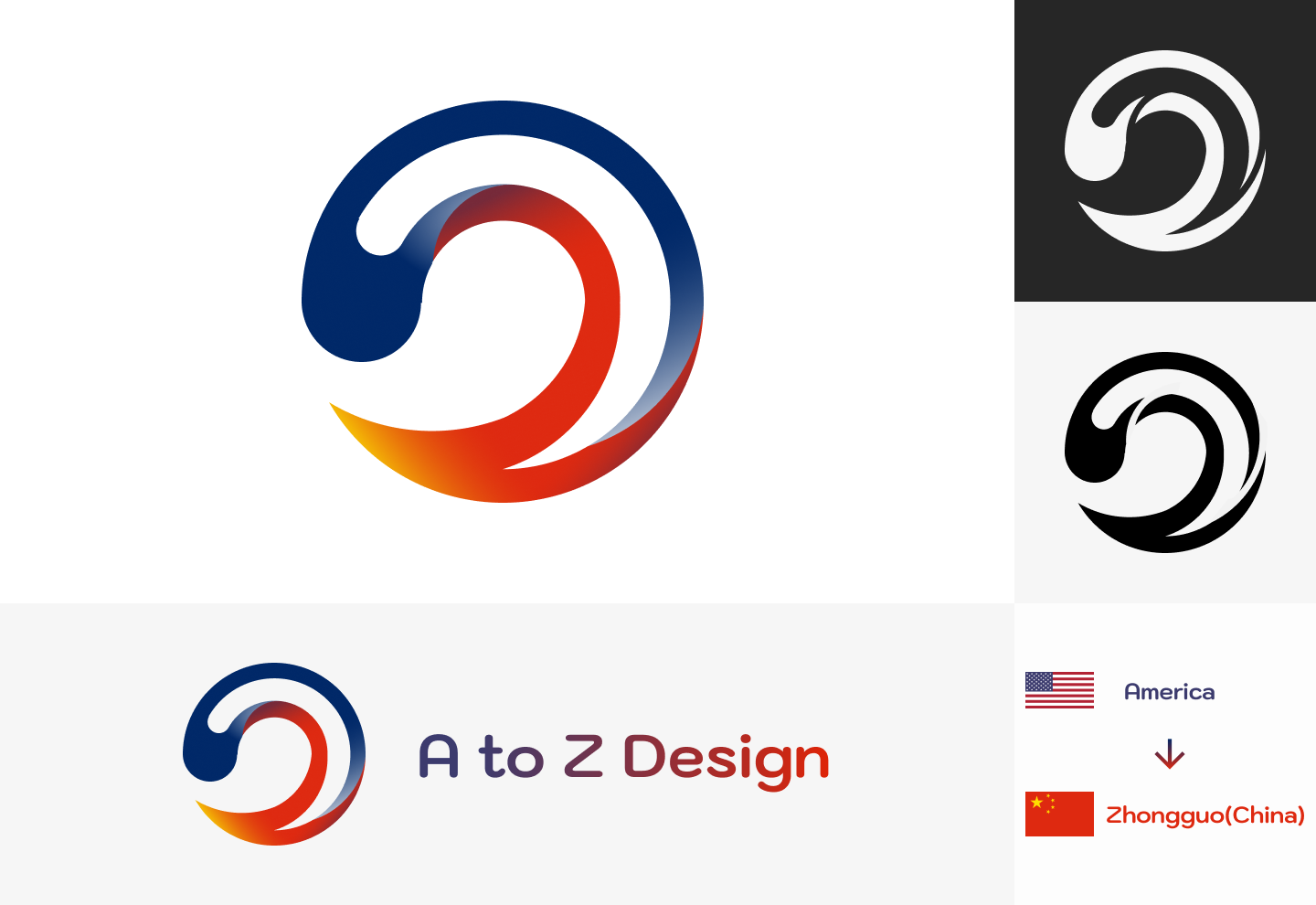
A to Z Design
This logo designs for the company called A to Z Design. Their office is located in America and their most clients are from Zhongguo(China). The logo uses the main colors from these two countries' flags. And the round shape represents the earth, which means their service transfer over the planet end to end.
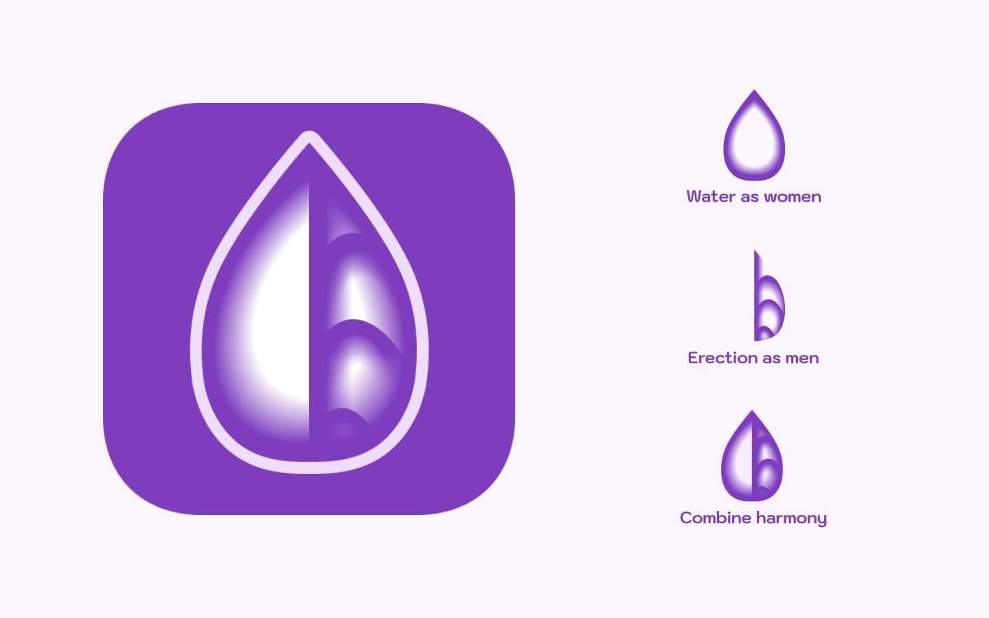
Sexual Community
This logo is designed for a sexual community app. It uses some obscure symbols to represent female and male, and harmonious combined together.
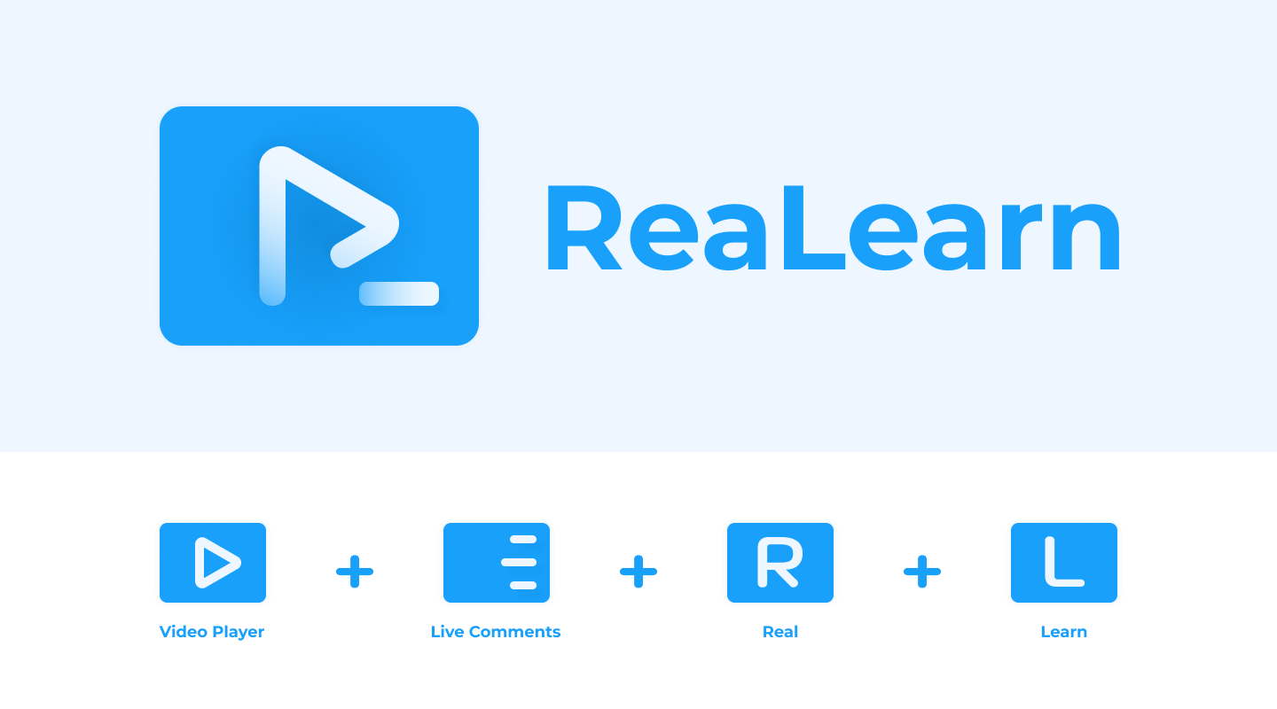
ReaLearn
ReaLearn is an online video learn website. Comparing with the traditional Mooc, the most special feature for this is adding live comments while watching videos.
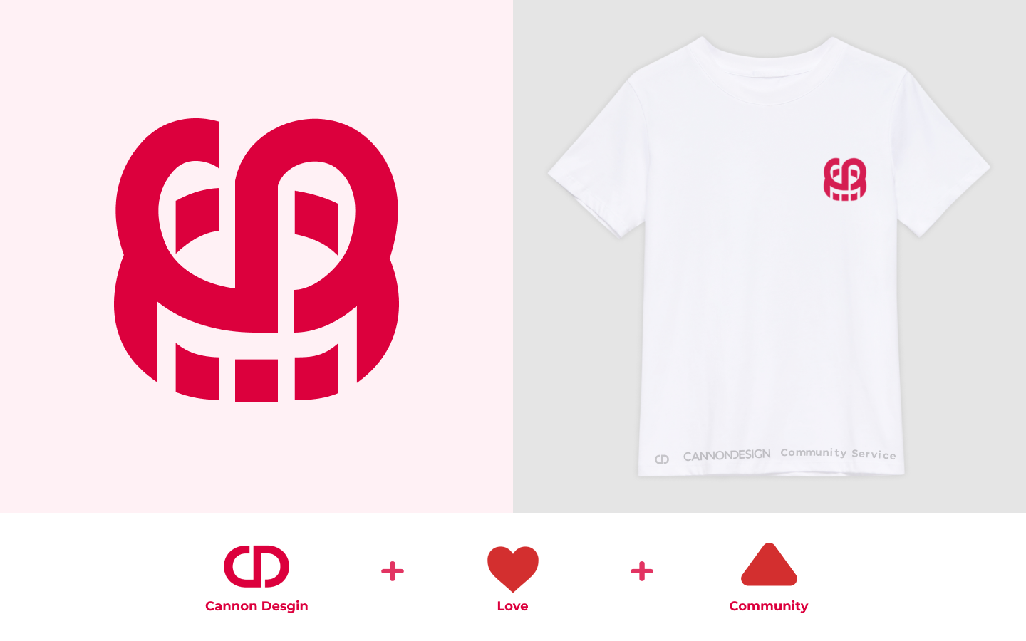
CANNON DESIGN Community Service
This is an unofficial design on T-shirt for CannonDesign Community Service, to show the kind heart to the society.