项目类型 Type: 网站设计 Website Design
项目周期 Duration: 9个月 9 months (side project)
项目成员 Team: 刘启睿 交互设计师 Cheryl Liu (myself), 陈楠希 产品经理 Nanxi Chen - Product Manager
工作背景 Context: 创业公司实习项目 Startup Company - Side project
工作职责 Role: 用户调研 原型设计 视觉设计 UX Researcher and Designer, Prototyping
发现问题 Problem Definition
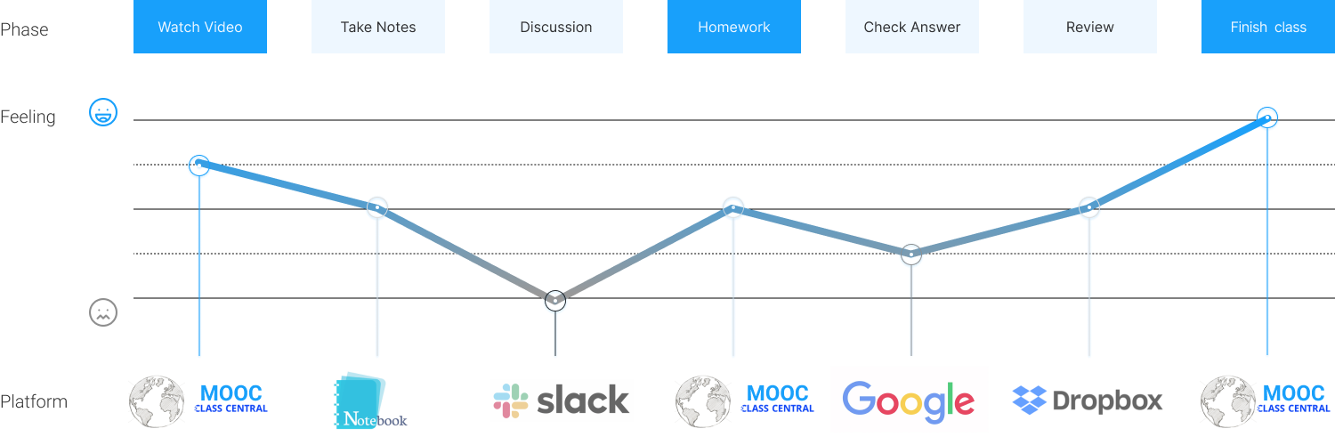
很多学生在视频网站自学时,都需要在多平台跳转,才能完成课程内容。这一现象大大降低了学生完成课程的比例。
The problem I suspect is that, MOOC learners have to use too many platform to finish one class.
领域Industry: 视频在线课堂 MOOC
举例 Example:
观看视频 - MOOC website
学习笔记 - notebook
课堂讨论 - Slack
课后作业 - MOOC website
检查答案 - Google
回看课件 - Dropbox
完成课程 - MOOC website
etc.
解决办法 The Solution
1. 在视频课程中增加弹幕功能,有助于学生更好理解课程内容。
1. Use live chat feature in the learning video, which helps students to better understand the class content.
2. 整合学习、测试、讨论、复习功能,使学习过程扁平化。
2. Finish your Learn, Test, Discussion, Review all in one page. Flatten the learning process.
3. 作业内容得到及时反馈,更好掌握重点难点。
3. Get the instant respond for the assignment, which helps to comprehensive the answers and key points.
分析过程 Process
在项目的整个过程中,我们通过进行用户调研,原型设计和多轮可用性测试来积极吸引目标用户,以理解他们的痛点和需求,而作出相应的设计决策。
Through the whole process of the project, I actively engaged the target user population by conducting user research, prototyping and multiple rounds of usability testing to understand their pain points and needs to inform the design decisions.
1. 用户调研 User Interviews
从身边的朋友同事入手,根据观察猜测他们可能的学习习惯,寻找四名目标用户进行一对一访谈。通过提问 who, which, what, why,了解用户在使用类似平台时的场景,需求,行为。

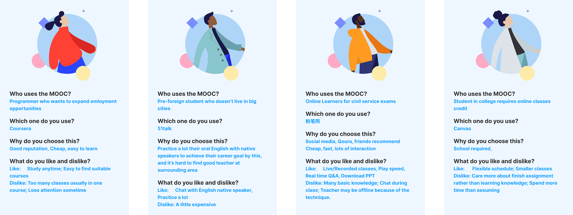
发现1:通常用户会被网站口碑、课程价格、课程内容、学习场景所吸引。
发现2:大家普遍会遇到完不成课程内容的情况,除了已经预想到的与网站设计有关,能否完成课程还与用户本身的决心有正相关性。
发现3:用户通常在寻求职业发展或突破。
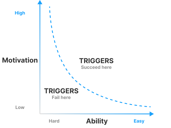
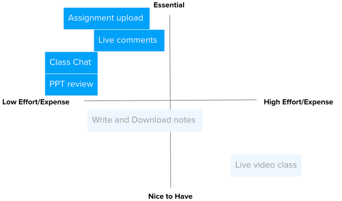
2. 重要性矩阵图 Prioritization Matrix
头脑风暴网页可能需要的功能,如:直播课程、弹幕交流、记录笔记、完成作业、课后讨论、下载课件等。根据重要性和实现的难易程度绘制矩阵图。得到结论那些是本网站的设计MVP(Minimal Viable Product) 。
核心功能 Key Feature:
完成作业 Assignment upload
弹幕交流 Live comments
课后讨论 Class chat
课件复习 PPT review
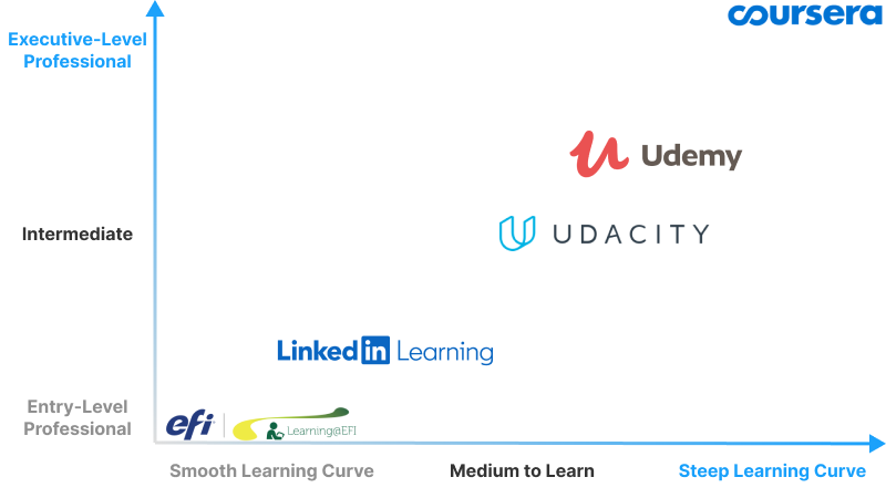
3. 竞品分析 Competitors Analysis
通过分析知名MOOC网站的专业性与完成难度,绘制矩阵图,可以得出,通常情况下,越专业的学习平台完成课程的难度越大。分析这些网站的异同,如何打破这一规律,设计出专业并且容易习得的视屏学习网站,成为本设计的重点与难点。
竞品分析主要聚焦在5个界面:网站主页、搜索界面、课程信息、学习讨论、个人主页。观察网站框架与结构逻辑,吸收优点摒弃缺点,将前期调研结论融汇到新的设计中。

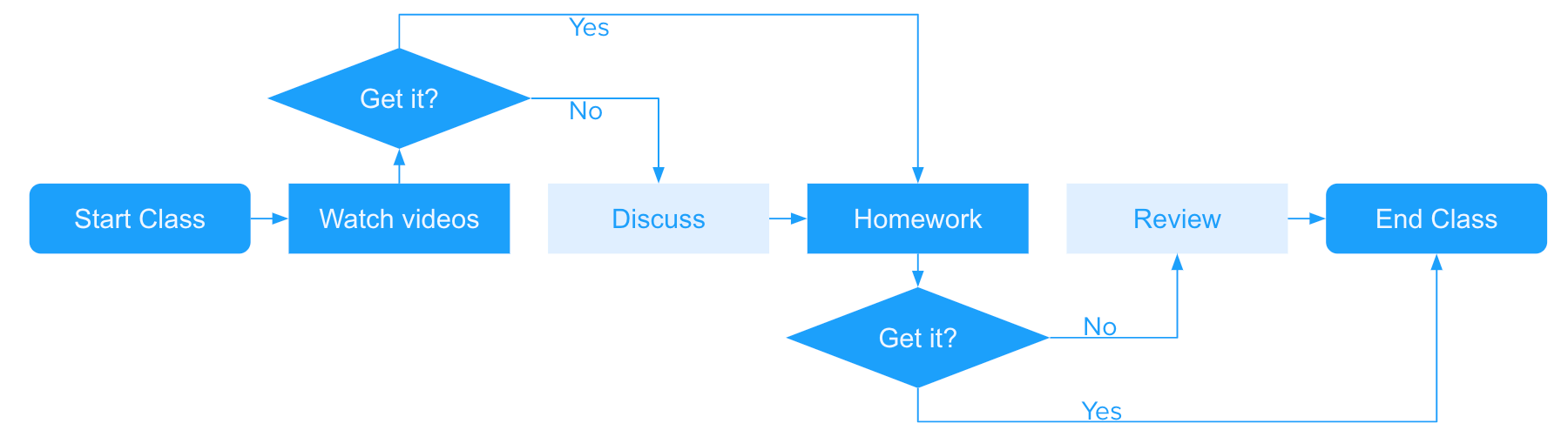
4. 流程图 User Flow
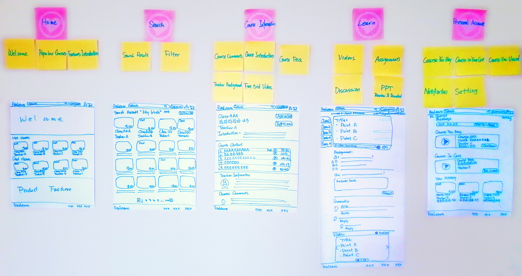
5. 卡片分类 与 手绘草图 Card Sorting and Sketch Screens
确定设计的核心功能后,在这一阶段,每个界面所包含的内容是设计重点。
网站主页 - 主页是吸引用户的窗户,所以根据前期用户调研,网站口碑、课程价格、课程内容、学习场景这些特点应该有所体现。
搜索界面 - 罗列课程,简洁明了,方便筛选。
课程信息 - 课程内容、课表信息、购买方式、师资力量、课程评价。
学习讨论 - 根据流程图分析,页面顺序与用户的使用习惯相同,顺序为学习视频、课堂作业、课后讨论、课件复习。
个人主页 - 为方便交流,通知是这个界面最活跃的区域之一,同时还有自选的课程进度。因为界面与购买也息息相关,所以加入了广告区域促进销量。
6. 低保真原型 Low Fidelity Prototyping
在手绘草图的基础上增添一部分视觉属性(例如元素的形状,基本视觉层次等)、内容的关键元素、及制作重点组件的交互效果。

7. 原型测试 与 设计迭代 Prototyping Testing and Iteration
测试与迭代贯穿在整个设计中,从用户的角度看问题,随时改善设计。
手绘草图 - 发现之前没有考虑的细节,如返回等,记录用户在乎的重点。
低保真原型 - 观察交互的流畅性,增添了多重导航使之更符合用户习惯。
高保真原型 - 记录用户在不同区域界面停留的时长,细化重点。

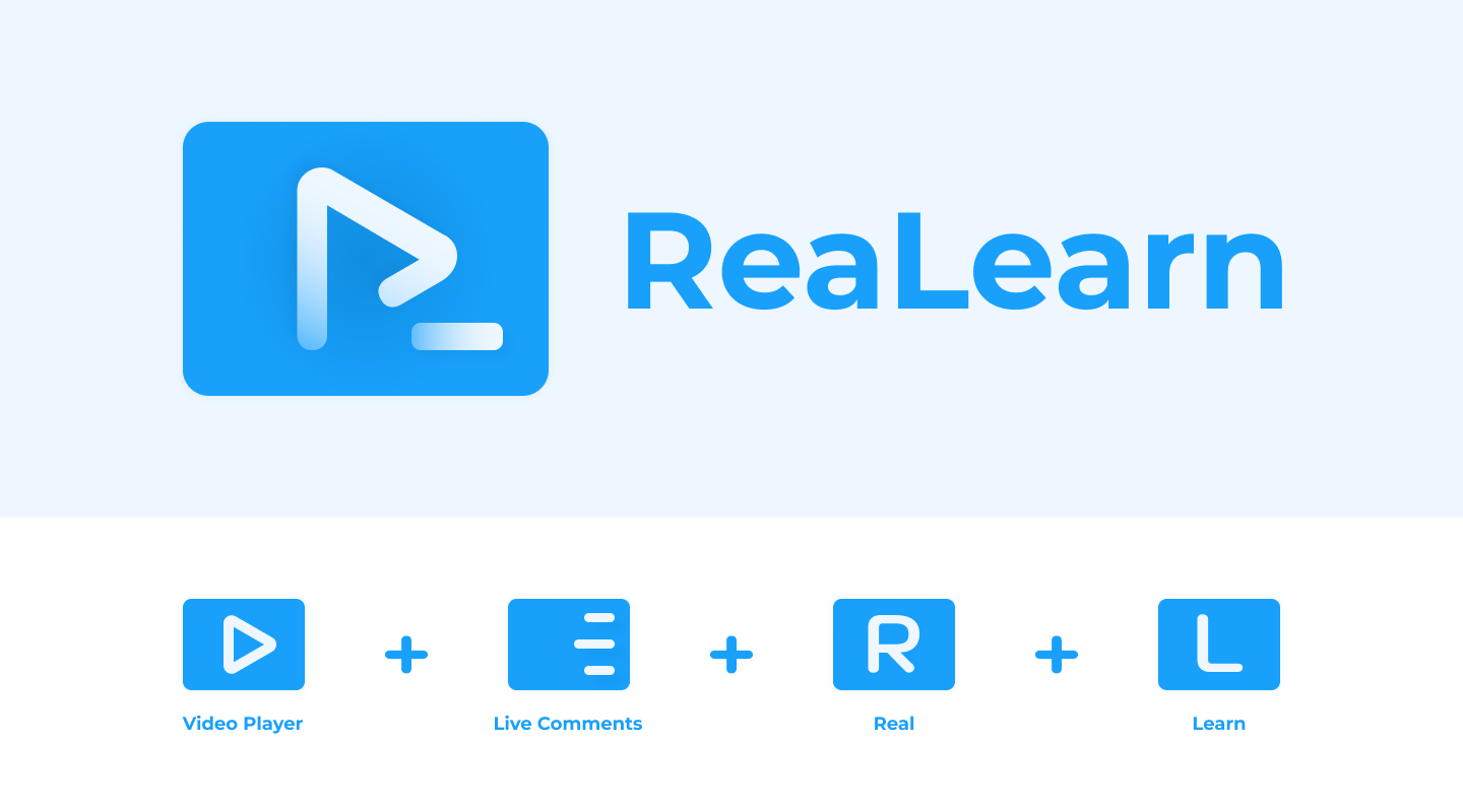
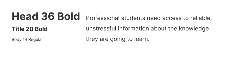
8. Styleguide
Logo
The logo combines two letters "R" and "L" to emphasis the brand ReaLearn. It also shows the most special feature for website is adding live comments while watching videos.
Color
We're combing a bright activating blue and another subtle light ones. Thus creates visual tension with friendly and cool tone.
Typography
Studying online requires digging through a lot of information. By using Inter sans-serif fonts, we're reducing the visual buzz for our users and are contributing to an approachable look and feel.

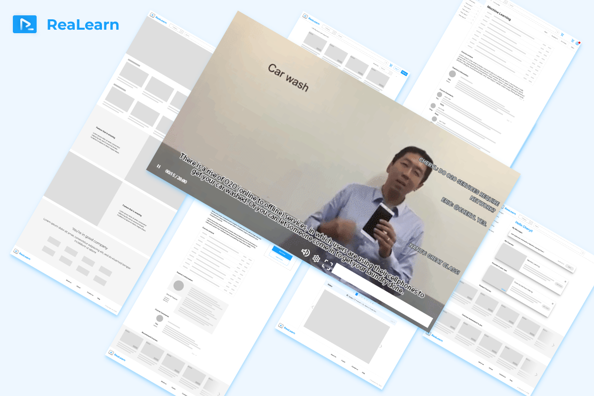
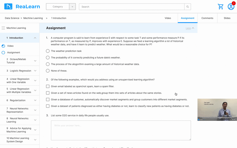
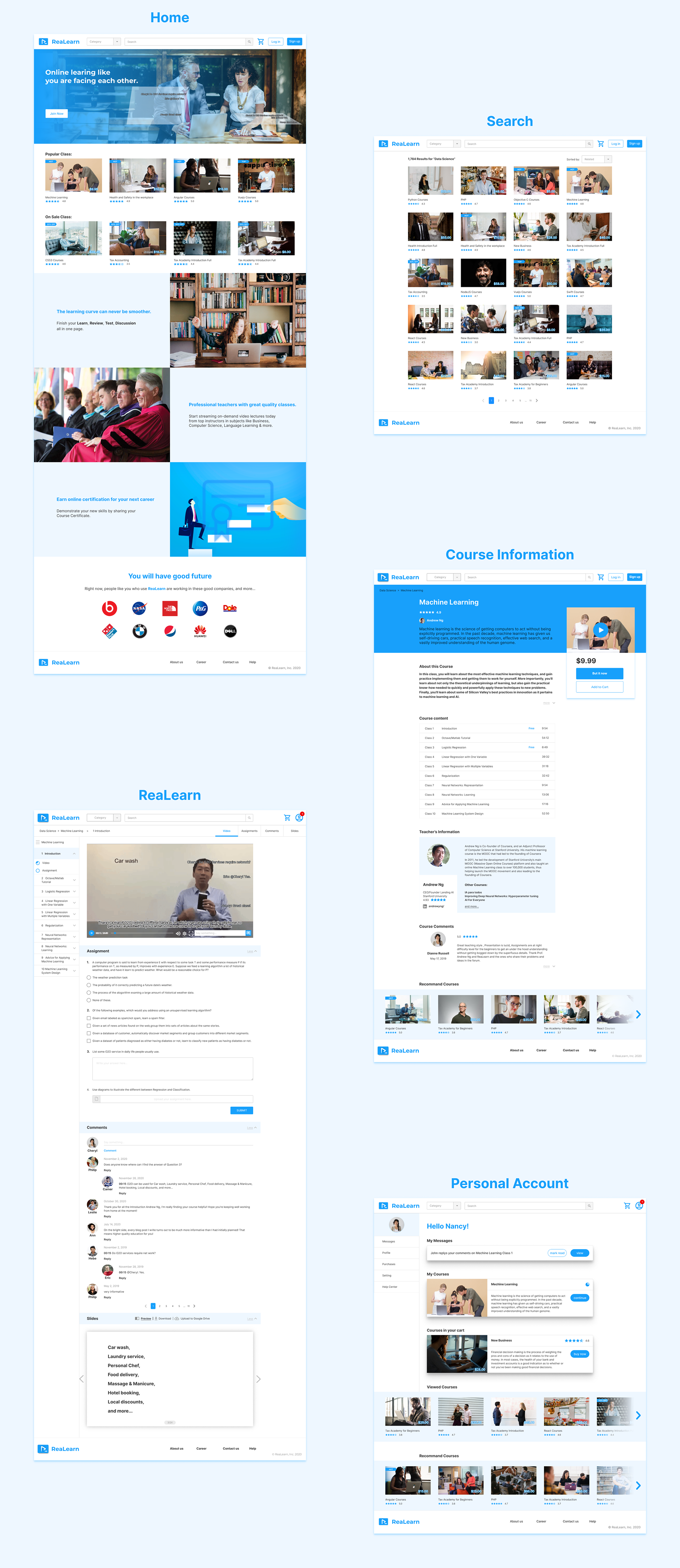
9. 高保真原型 High Fidelity Prototyping
视频学习网站 ReaLearn 为想用灵活时间做专业技能提升的个人而设计,拥有以下几个主页面:
网站主页 Home、搜索界面 Search、课程信息 Course Information、学习讨论 ReaLearn、个人主页 Personal Account。
最核心的设计点集中在学习讨论 ReaLearn页面,拥有学习视频、课堂作业、课后讨论、课件复习等功能。学习不再局限自我,通过设计流畅的学习体验提高课程的完成率,增强学习的满意度。
欢迎体验可点击交互原型:
设计反思 Reflection
首先一个好的设计师不只是设计用户想要的东西,而是要找到用户深层需要的东西。
A good designer does not just design whatever he/she wants to design. Instead, find what’s really needed is important.
同时设计不仅是伏案工作,多与用户交流,做出适合用户适合市场的产品。
Try the best to see the world through the users’ eyes, to see what they see, feel what they feel, and experience things as they do.